
EMAasociativo Burgos: what a room of managers told us without filling in a single survey
We measured the EMA working session with medical society managers in Burgos using Emogg Analytics. Which topics held attention, when energy rose, and why this data is worth more than a post-event form.
On 9 October, as part of the Asociativo Castilla y León MICE day in Burgos, EMA (Event Managers Association Spain) brought together managers of medical societies for a small-format, focus-group-style workshop facilitated by Albert Cerezales (Insidery). The aim: to listen, in a structured way, to the challenges reshaping their work, from the future of the medical congress to the use of data and technology.
Emogg Analytics measured audience response across the 2 h 48 min session, split into two blocks. What came out of it is exactly the kind of insight any organiser would want from their own events.

The problem with asking at the end
The usual way to find out whether an event worked is the satisfaction survey. We all know its limits:
- It arrives late. People answer once the session is over and memories have blurred.
- Few people respond, usually the most satisfied or the most annoyed.
- It measures stated opinion, not what happened in the room minute by minute.
- It interrupts the attendee experience and adds friction right at the close.
- It doesn't tell you which moment worked or failed, so it is hard to decide what to change.
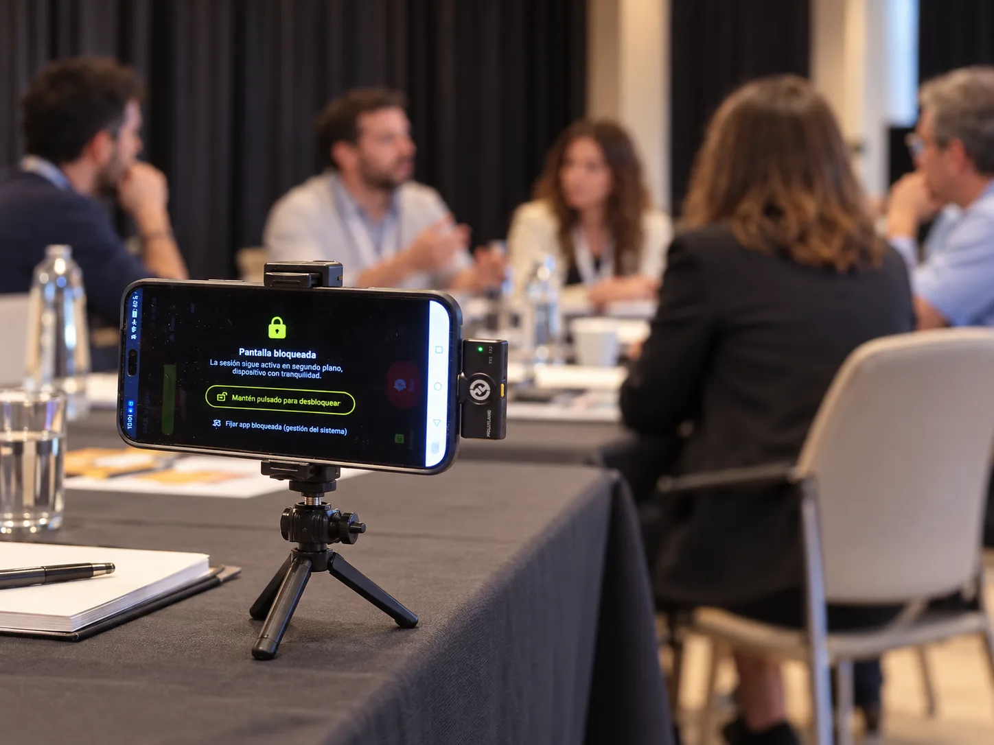
In Burgos nobody had to fill in anything. Measurement ran on a discreet device on the table, without interrupting the conversation, with aggregated, anonymous results: no individual is identified and no images are stored.
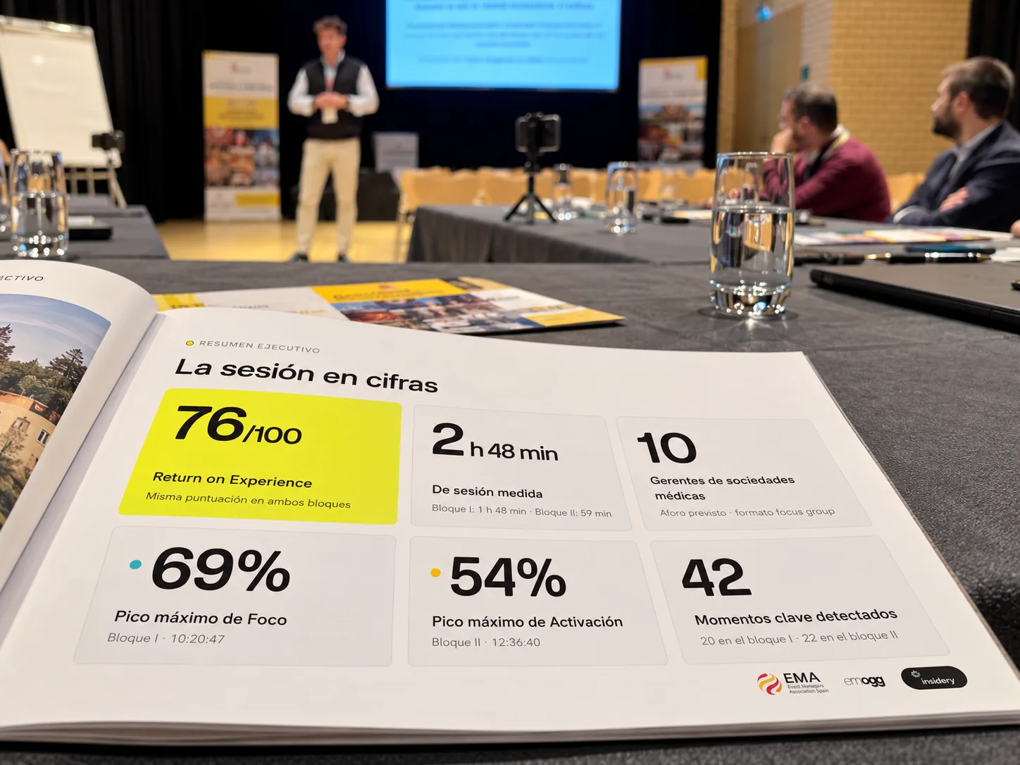
The session in figures
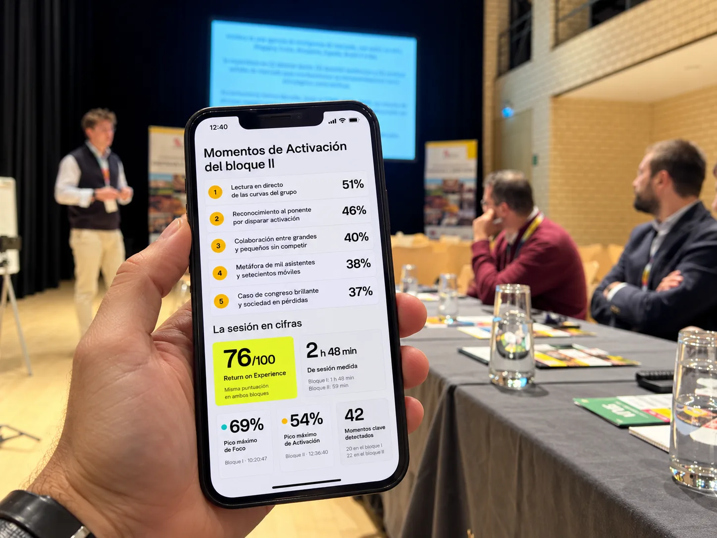
- 76/100 Return on Experience, the same score in both blocks.
- 69% peak Focus (block I) and 54% peak Activation (block II).
- 42 key moments detected: 20 in the first block and 22 in the second.
What really held attention
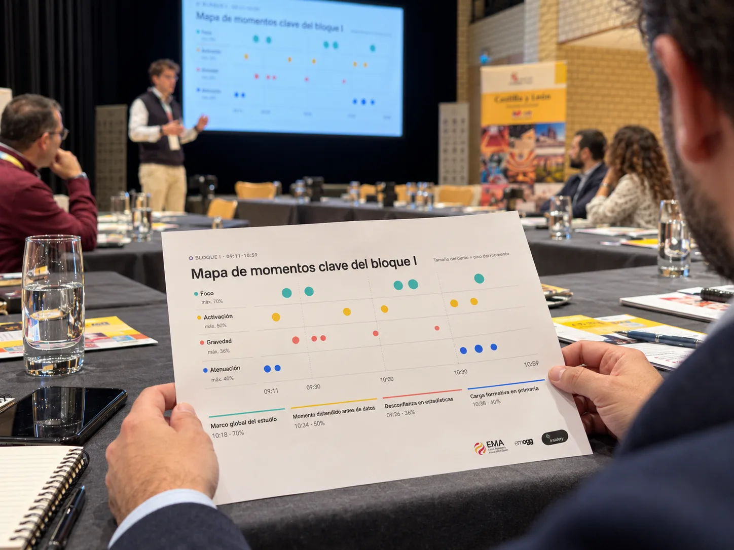
With the measurement aligned to the running order, you can see which topics concentrated the room's attention. The highest Focus peaks were:
- The overall framework of the study and its relevance to the sector: 70%.
- The summary of learnings and next steps: 68%.
- The debate on ROI and data versus intuition in events: 64%.
- The crisis of the classic medical congress model: 60%.
- Segmenting societies by size: 54%.
For an organiser this is gold: it is not what attendees say interested them, but where their attention actually was. It helps decide which topics to expand, which to trim and how to build the next edition's programme.
Two blocks, two behaviours
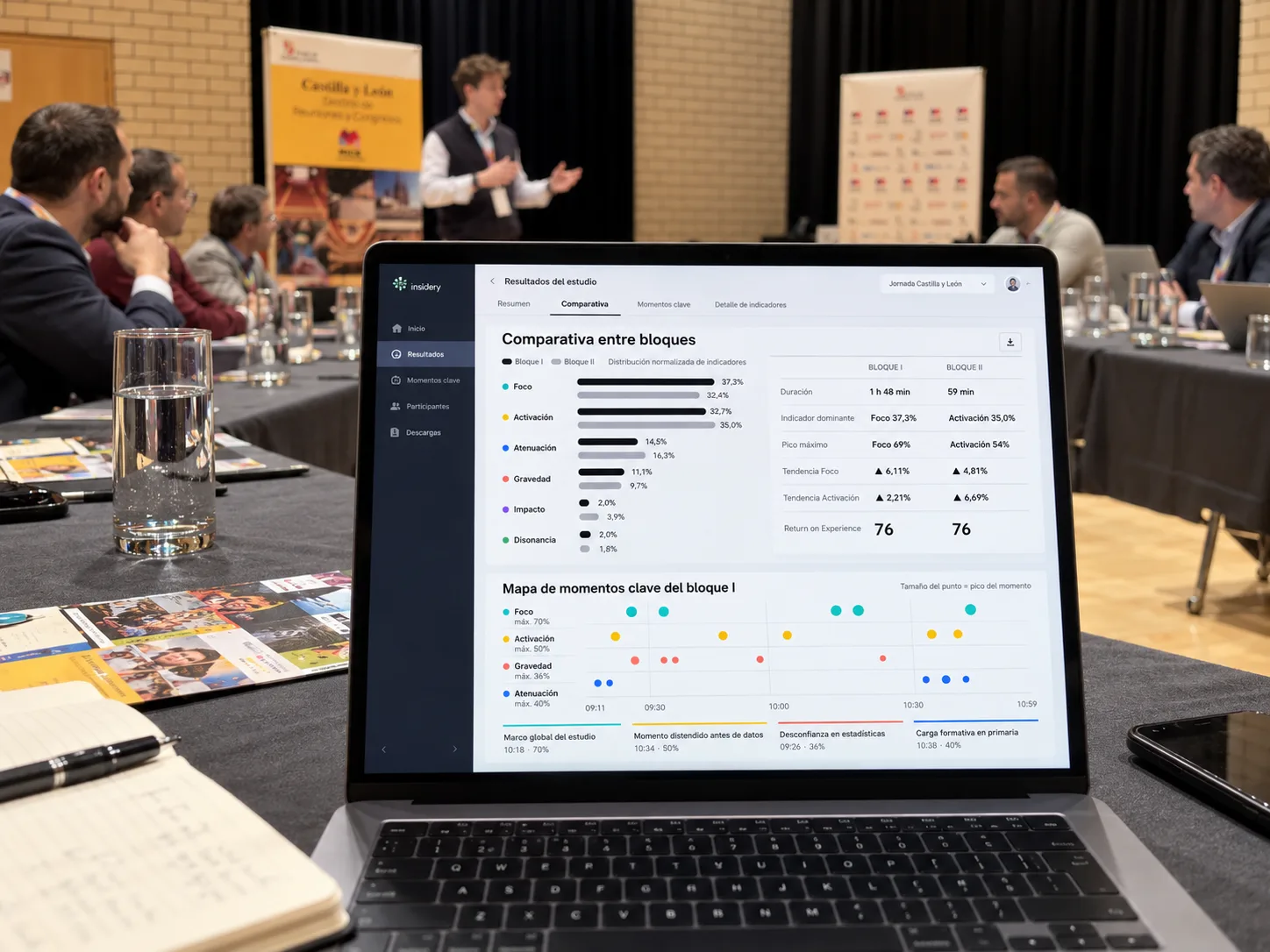
The block comparison shows something no survey would have picked up:
- In block I (the medical congress under debate), the dominant indicator was Focus (37.3%): an attentive room, listening and processing.
- In block II (the role of the Event Manager), Activation (35.0%) took over: more energy and participation. Its peak came when the group's own curves were read live.
- In both, Focus and Activation trended upwards, while Dissonance (2.0% and 1.8%) and Saturation (0.3% and 0.9%) stayed at residual levels: a reflective atmosphere, with no friction or fatigue.
Knowing when a room listens and when it activates lets you design an event's rhythm better: where to place the dense talk, where to open the debate, when to break.
Data used during the event, not just afterwards
One of the highest Activation moments was sharing the results with attendees while the session was still under way. The data doesn't sit in a report that arrives weeks later: it is available on the dashboard and on mobile, and can feed the conversation itself.
What an organiser gains
- Objective evidence to justify decisions and budget to boards, sponsors and members: the ROI debate was, in fact, one of the topics that drew most attention in the room.
- Better-designed programmes, based on which content works and in what order.
- Speakers and formats assessed moment by moment, not with an average score.
- Zero friction for attendees: no forms, no interruptions, nobody identified.
Surveys will still have their place for gathering opinions. But if you want to know what really happened in your room, you need to measure it while it happens.